CARDS FOR SALE

Most cards you see on this site are available for purchase. Simply click the Pay Now button at the bottom of the post of an available card to purchase the card. You will be linked to PayPal for payment. It will come up as "greensnaggletooth@cox.net" which is the name of my internet company. Price is $5.00 unless otherwise stated and includes shipping. Your card will come with an envelope also. Email me with any questions or requests at: sharynsstampbiz@gmail.com
Thanks for taking a look at my creations!!

Wednesday, February 29, 2012

Lovely Springtime

Happy Leap Year Day!!!   Welcome to Wednesday everyone.  Well yesterday we finally cooled down again here in Phoenix.  Our high was only in the 60's instead of in the upper 70's to low 80's.  Now some of you may think those temperatures are nothing to complain about and you are right.  It is just that the sooner we start warming up, the hotter the summer usually is.  Believe me, 115 degrees is nothing to reach during the summer and the longer it can be put off the better.

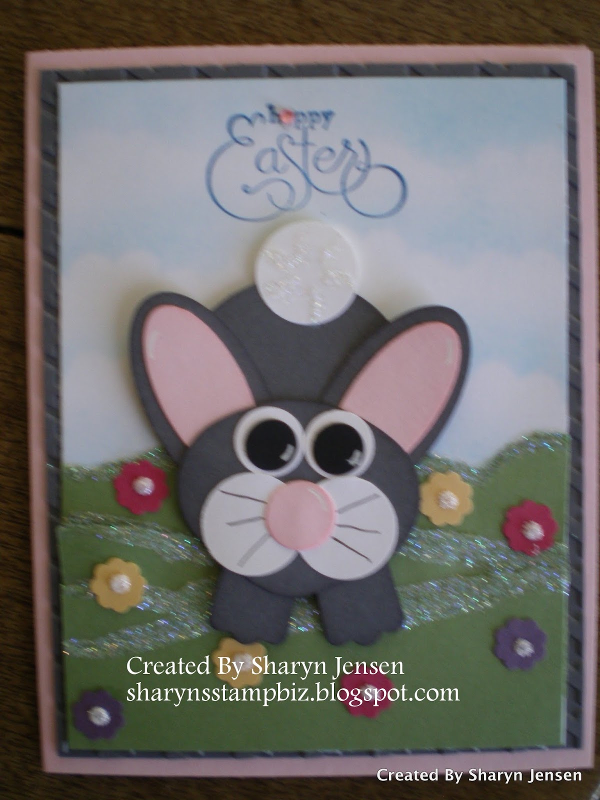
As we move into these nice temperatures though we see the flowers beginning to come back and the trees looking green again.  Well you cannot help but think of spring.  It always amazes me how we jump from holiday to holiday in the stores.  Now I love Easter but with it being over a month away, I am not ready to shop for it.  So I decided today I would make another critter based on the tutorial from Kim Score.  While I did use some of the information for this one, I changes a few of the items to suit my needs.  So let's get started.


I started with a base card of Marina Mist cut at 4 1/4" x 11", scored at 5 1/2".  I then cut a piece of Basic Black card stock at 4" x 5 1/4".  I took that piece and sprayed it with a champagne shimmer spray made with 2 oz of alcohol and a few drops of the champagne shimmer paint.  I know you cannot really see it in the picture but when the light hits the card just right, it sparkles!  Once it was sprayed and dried (this happens very quickly) I ran it through the big shot using the Finial Press impression folder.  Next I took a piece of Whisper White card stock and using the Lace Ribbon Border punch, I punched a strip to place across the card.  


I turned to my Teeny Tiny Wishes stamp set for the greeting on this one.  I stamped the greeting with StazOn black ink onto Whisper White card stock.  I then punched it out using the Word Window punch.  Next I took a scrap piece of Marina Mist card stock and punched out a Modern Label.  I layered the greeting on top of the modern label.  I wanted to add a little something to the greeting so I went to my box of brads.  These are not from Stampin' Up! but they are cute.  I picked up these little flowers at a convention not too long ago.  I used a light purple set for this card.  I attached this using dimensionals.


Here is a close up of my butterfly.  The face is the same from the dragonfly yesterday.  I did use one piece of the body that Kim had in her instructions.  I made the antennas black first but changed it when I realized you would not be able to see them on the background.  I went with Melon Mambo instead.  I also used the scallop flower from the teeny tiny punch pack.  I punched one in black, cut it in half, and placed them behind the eyelids for lashes.  Again if I had been thinking ahead, I would have used a different color since they really do not show up.  I added glitter to the nose for personality.  The wings included in the instructions were completely different from what I did so I will share this with you.   For my wings, I chose to use Vellum Paper.  I ran 2 pieces of this through my big shot using the Beautiful Butterflies die.  I used the half butterfly wings on it, cutting out 2 of each size.  I then used some glitter from my huge stash of glitter to add colorful dots to the wings.  I let these dry completely.  Once dry, I attached the small ones first to the body using a glue pen, and then I attached the large ones behind that using the glue stick.  I attached the completed butterfly to the card using dimensionals. 

Finally everyone at my house if feeling a little better.  Hopefully all will be well by the weekend.  I will return tomorrow with another card to share with you.  Thanks for dropping by today and I will see you tomorrow. 
 

Tuesday, February 28, 2012

Outside Inspiration

I love making cards, but I will admit that I do not know everything.  I am constantly learning new techniques and new punch art designs.  While I do spend a lot of time working on my own ideas, it is impossible to not look to see what other demonstrators are doing and be inspired by their work.  With that being said, I want you to know that my design for the card I will show you today is an inspiration from someone else.


I fell in love with this little guy the first time I saw him.  The base card is Marina Mist with a layer of Basic Black on top of that.  The top layer is a piece of Whisper White.  Once again, I wanted a sky scene so I used my pastels to make a sky.  Now I have to tell you a funny story.  I never have claimed to be perfect and this card proves it.  I took the greeting from the Perfectly Penned stamp set and wanted to stamp it using Marina Mist ink directly onto the card.  I bet you can see that it is actually on a separate piece of white card stock that I attached to the top of the card with runner adhesive.  Well the reason it had to be put on this way is because I did stamp it directly onto the card - upside down!  I could not believe I did that.  Then I had to recover from laughing before I could fix it.  So needless to say, this card will be a sample and not one I would sell or give anyone.  I will have to make another one. 


To learn how to make this little guy, I visited Kim Score's blog .  On her blog, she has tutorials that are for sale at very reasonable prices.  I bought the tutorial that included the instructions to make this dragonfly.  Because this is not my original design and is not on the web for all to see, I cannot give you the specifics on how to make him.  You are free to visit her site and purchase the tutorial if you like.  I did change a few things on him to make him more of what I wanted.  I do hope you can understand why I cannot provide the directions.  If you live near me, watch your email.  There may be a class coming up soon where we will learn to make this little guy.  

I am trying my best to get a lot of rest this week.  Everyone in my house except me has been sick for the past few days.  I hope not to catch it!  After all, I got a clean bill of health from my doctor yesterday.  

I will return tomorrow with another card that I hopefully don't stamp upside down on.   Thanks for dropping in today and I will see you tomorrow. 

Monday, February 27, 2012

Short Post Again

Happy Monday everyone!  I am going to do an extremely short post today as I have a doctor's appointment to get to.  My doctor is one of those where I am always early and he usually runs late.  So it leaves me with little time to blog.

Today's card used a set I used on this one was one of my favorite sets out in the Occasions Mini last year.  It is called Easter Blossoms.  There were so many stamps in this set I loved I knew I just had to have it. 


My base card for this one is Pretty in Pink card stock cut at 5 1/2" x 8 1/2", scored at 4 1/4".  .  I then added a layer of Crumb Cake on top of that cut at 4" x 5 1/4".  For the final layer, I cut a piece of Perfect Plum at 3 3/4" x 5".  I added all stamps before I attached it to the card.  For the little girl, I stamped her with VersaMark ink  on the plum and then heat embossed her with white embossing powder.  I did add a rhinestone to her bow.  I used the blossoming branch stamp for the background for this.  I stamped the image on with VersaMark ink and let it dry.  You want to make sure you do the girl first since she will be heat embossed and the branches will not.  If you stamp the branches first, you run the risk of embossing powder sticking to them too.  I added white gel pen to a few of the flowers for visual effect.  Then I edged the plum piece with plum ink and adhered it to the other layers.  

I wish I had more photos to show you.  I had taken this one and loaded it on my computer.   I usually take a few more before I blog but since my husband has the camera today I am out of luck!!   

I will be back tomorrow with a longer blog that has more than 1 picture.  I hope you all have a wonderful day.  See you tomorrow and thanks for dropping in today!!

Friday, February 24, 2012

Bouncing Bunny

I want to start today's blog a little different.  I received a comment on one of my posts the other day from a fellow card maker who asked that I mention her blog and name when I use an idea of hers on one of my cards.  I really do try to keep a record of ideas, the blog where I see it, and the name of the person who made it as best as I can.  If I ever do post something you know you have made please feel free to tell me.  I will say that I visit a lot of blogs every day and do not track every idea I see.  I only track ones I definitely plan to revisit or possibly use.    In this case, I did not write the information down so when I sat to design a card, this little picture of the focus animal on the card popped into my mind.  I could not remember where or when I has seen it so I could not reference the designer.  I really would have referenced the other designer if I had remembered as I feel it is very important to give credit to others for their hard work.  So thank you for reaching out and letting me know.  In the future I will try to be more diligent in referencing others blogs.  I am not perfect but I will give it my best effort.

That being said, I do want to start today by letting you know I saw a similar design to the bunny on my card at another card maker's blog.  Her name is Juliana (there was no last name listed that I saw) and you can see her bunny here if you would like to see her design.  I changed the color of the bunny and the way the ears were on the rabbit.  I also changed my background.  Only the basic idea of the rabbit was cased.  Now that I have taken care of that (I did not want to forget today : ) ) let me show you my card.


The reason this bunny caught my eye is I love how he looks like he is hopping down the hill.  I started with a Pink Pirouette base card cut at 5 1/2" x 8 1/2", scored at 4 1/4".  I then added a layer of Basic Gray measuring 4" x 5 1/4" which I had run through the big shot using the Houndstooth impression folder.  Now you really cannot see the texture on this so it us up to you if you want to do this step.   Next I took a piece of Whisper White card stock cut at 3 7/8" x 5 1/8" and using my pastels (chalks) I created the sky background on it.  I then took a scrap of Wild Wasabi card stock and tore strips of it to make the hill.  I added Dazzling Diamond glitter to the edges of the grass for added effect.  Next I used the scallop flower from the itty bitty punch pack and punched flowers in Perfect Plum, Rose Red, and So Saffron.  I scattered these around my hill and then added a dot of Stickles glitter glue to the center of each flower.  While this dried, I started building my bunny.


I will give you a run down of the punches I used to make him.  I chose the colors for this guy to be Basic Gray, Pink Pirouette, Whisper White, and Basic Black.  The ears are comprised of 2 punches - the large oval punch and the retired small oval punch.  His body is a 1 3/4" circle punch.  For the head, I used the ornament punch.  I cut off the hook and rounded the tip for his chin.  The cheeks and tale are from the 3/4" punch.  I drew the whiskers on the cheeks with a fine tip black pen and added Dazzling Diamond glitter to the tail.  The nose and white of the eyes are from the 1/2" circle punch.  The black of the eyes is the circle from the itty bitty punch pack.  For his little feet, I punched a modern label and cut it in half.  I added white gel pen to the eyes, nose and ears for enhancement.  All in all he is pretty easy to make.  


Here is a closer look at the face and at the hills and flowers.  I just wanted to be sure you could really see all the details of the background.  


Last but not least is the greeting.  I used a stamp from the retired stamp set Well Scripted.  I stamped it in Pacific Point ink directly onto the card.  As I was looking at this, I decided a more appropriate title might be "hoppy Easter" so I took out my rhinestones, chose a pretty pink one, and covered up the "a" to make it an "o".  Hopefully that will come across to the recipient of the card.  I do apologize for the blurriness in the picture.  I took several shots but this was the best.  Apparently, I need to work on my photography skills!

We have once again reached the end of another week.  Take time this weekend and do something fun.  Spend time with family and friends if you have the chance.  I will be back on Monday with another card to share with you.  Thanks for stopping by today.  Have a great weekend and I will see you Monday!!


Thursday, February 23, 2012

Another Wedding Card

My daughter has a friend who is getting married soon and came to ask me to make a wedding card.  So I thought why not share it with you too.  After all, I love sharing my creations and hope you enjoy seeing them.  So let's get started working on this now.


I spent quite a bit of time trying to decide my color scheme for this one.  I decided to start with a Shimmer White card stock base.  I cut it at 4 1/4" x 11", scored at 5 1/2".  I then added a layer of Basic Black card stock measuring 4 1/8" x 5 3/8".  I then took a piece of Brushed Silver card stock measuring 4" x 5 1/4" and ran it through the big shot using the Vintage Wallpaper impression folder.  I love the elegant look you get from this.  I then layered all 3 of these together using runner adhesive.  For the main design on top, I turned to my handy Blossom Bouquet Triple Layer Punch.  I punched flowers in Shimmer White and Basic Black.  Using the outer ring of the flower, I created this interlocking pattern to lay on the silver.  I used a liquid glue to adhere these together and to then lay them onto the silver.  


Here is a closer look at the interlocking flower rings as well as the flowers themselves.  I added a few white flowers into some black rings and some black flowers into white rings.  I adhered them with a glue dot in the center of the flower and liquid glue on the rest of the back.  I wanted to be sure they stayed put.  I then took out a pack of black and white pearls that I have and added white pearls to the black flowers and black pearls to the white flowers to make the centers really pop.  I liked the simple elegant look of the finished card.  But because she is my daughter, she decided she wanted some glitter added to it.  (Guess I raised her right!)


I chose to use my Stickles glitter glue in Silver to do the glittering of this one.  I was concerned that if I used the glue and loose glitter, it might get into areas I did not want.  This was a nice way to add just one color of glitter to the card and not worry about the clean look of it.  

So what do you think?  My daughter is out right now and has not seen the final product so I will have to let you know if she liked it or not.  Tomorrow, I am going back to more Easter punch art.  I can't wait to share this one with you!!  It is so cute!

Thanks for dropping by today and visiting.  Please come back tomorrow.  I will see you then!!


Wednesday, February 22, 2012

Splish Splash

I am working on several Easter cards right now hoping to teach a punch art class featuring these.  So I will have at least two more to share with you this week.  Hopefully I will be able to schedule a class in March.  It has been a while since I had one here and I am looking forward to doing it again. 

Today's card features a critter who would love to go Splish Splash.  This design actually came to me in the shower so I guess it really fits the title.  This is also a card that could be for Easter or just for a spring time card for a birthday or whatever.  So let's get started.


Now I hope you can recognize that this is a duck.  I could not help myself with this little guy.  He is just too cute to me.  My base card is Tangerine Tango card stock cut at 5 1/2" x 8 1/2", scored at 4 1/4".   The first layer on top of that is a Basic Black piece of card stock cut at 4 1/8" x 5 3/8".   Next I cut a piece of Whisper White at 4" x 5 1/4".  I used my pastels to chalk a sky with a gray chalk.  Using a scrap piece of Soft Suede and tore a couple of pieces to use as the ground.  I attached them using runner adhesive and then added dazzling diamond glitter to the edges.  For my puddles, I used a scrap of Pacific Point card stock and punched out 2 wide ovals.  I trimmed them to a shape I like, adhered them with runner adhesive and of course added some glitter.  To make my water drops, I turned to the Blossom Bouquet Triple Layer Punch.  When you punch out the flower, you get these perfect tear drop shaped pieces that work wonderfully for the drops of water.  I saved the flowers for another time.  These were made out of Pacific Point.  I used a liquid glue to adhere them and again turned to my glitter to embellish them.  


I turned to my handy big shot and my Billboard sizzlit decorative strip die.  I cut these out of Basic Black card stock, adhered them with liquid adhesive and then added black glitter to them.  Next time I would add the glitter to the letters first.  I feel it would have a much cleaner look.


Now for the duck.  I used Daffodil Delight, Tangerine Tango, Basic Black, Whisper White, and Pacific Point card stock on him.  His head and body are made using the ornament punch.  His hair is the small flower from the boho blossom punch.  His bill is a large oval punch and his eyes come from the owl builder punch.  I used the largest circles from it for the white and used the medium ones for the blue and black part of the eyes.  For the tail, I attached the medium heart from the heart to heart punch.  His wings are a 1 3/4" scallop circle punch cut in half.  For his little feet, I started by punching 1 3/4" scallop circles.  I then used a large oval punch and traced it to get the size foot I wanted.  I cut them out and added them to him.  I also cut an extra one to use as a template in the future.  White gel pen was used to highlight certain areas.

Well we have once again made it to Wednesday.  I wish all of you a wonderful day and thank you so much for stopping by.  I hope you come back tomorrow.  See you then.
 

Tuesday, February 21, 2012

Let's Go Green Again!

As promised I have another St. Patrick's Day card to share with you today.  I guess this holiday stands out to me because my husband's favorite color is green and both he and I are part Irish.  So I am enjoying making these little treasures.  Let's get started shall we.


Once again, I chose to use Daffodil Delight card stock as my base card.  I then took a layer of Whisper White and added some shamrocks to it.  I made them using the small heart punch and the circle punch from the itty bitty punch pack along with Garden Green card stock.  I adhered these to the white using a liquid adhesive and then ran the white through the big shot using the Houndstooth impression folder.  This embedded the shamrocks into the white making it one piece of card stock.   I used the same retired Go Green stamp as yesterday, stamped with Garden Green ink on Whisper White.  Using Garden Green card stock, I made a frame for it.  It is attached using dimensionals.  I also added a rhinestone to the center of the shamrock for added dazzle.  


I used my owl builder punch to make my leprechaun owl for this one.  The colors I chose are Early Espresso, Wild Wasabi, Basic Black, Whisper White, Daffodil Delight, Pacific Point, and Tangerine Tango.   The hat and hat band were made using the large oval punch.  I used the wings from the bird builder punch so that he would have "arms".  Again the buckle on the hat was cut free hand.  


For my pot of gold, I used Basic Black and Brushed Gold card stock.  The handle is a large oval punch punched around a retired small oval punch hole.  The pot was made using a 1 3/4" circle punch.  I placed a large oval behind the pot above the rim and then added the rim which is a word window.  My gold pieces were punched using the itty bitty punch pack circle.  You can make your pot of gold as full as you want it to be.  If there is one thing I have learned about myself it is that I really enjoy using the itty bitty punch pack circle and my owl punch.  Rarely do I created anything without them.  

I hope these cards inspire you to try something new.  I would love to hear from you about your creations or even see them.  Feel free to contact me with any questions you might have about my cards or products that I use.  I do so appreciate your feedback.  Thanks for stopping by today and I will see you tomorrow.


Monday, February 20, 2012

Little Green Men

Now I am not referring to aliens here.  I am thinking of those little Irish men who show up every march and are sometimes up to no good.  Do you know who they are?  Leprechauns of course.  I have really been in a punch art mood for the last few days so I thought why not make a little leprechaun face from punches.  So let me show you my creation.


Well what do you think?  Let's start at the beginning and then we will take a closer look at him.  My base card for this one is Daffodil Delight.  I love the brightness of this color.  It makes me think of spring.  Next I added a layer of Whisper White card stock.  I ran it through the big shot using the Stripes impression folder.  I added some Garden Green ink to the edge of the white prior to adhering it.  The stamp I used is a retired one called Go Green.  It is one of the single stamps that you can order, well you could order this one a couple of years ago.  Anyway, it is stamped using Garden Green ink on white and then punched out using the decorative label punch.  I created a frame for it with Garden Green card stock using the same punch.  It is adhered using dimensionals and a rhinestone was added to the center of the shamrock.  For my little man's head, I wanted to use one of the new framelits sets called the Labels Collection.   I used 2 different sized of labels.  I cut a larger one out of Garden Green and then one size under it from Daffodil Delight.  I took the daffodil one and ran it through the big shot using the Square Lattice impression folder.   Now let's look at the man himself.


I made the head and the hat using the 1 3/8" circle punch.  For his band around the hat, I punched another 1 3/8" circle in Basic Black and cut it to fit.  The buckle part I cut free hand.  The brim of the hat is a word window punch.  The hat was made using Wild Wasabi.  The ears and nose were punched with the circle punch from the itty bitty punch pack.  Those as well as the face were made from Blushing Bride card stock.  For the hair and moustache, I used Poppy Parade card stock.  The hair is a 1 3/4" scallop circle while the moustache is from the blossom petal builder punch.  It is the smallest petal.  It took 2 to make it.  The eyes are Pacific Point card stock.  The were punched with the owl builder punch.  The black of the eyes was punched using a 1/4" circle punch.  I added white gel pen to his nose and eyes and drew the mouth on using a fine tip black marker.  Not bad for my first leprechaun!

I hope you all had a nice weekend.  I am sad to say I was stuck with my migraine headache for most of the weekend.  I still found time to be creative and to laugh.  Tomorrow, I will continue with the St. Patrick's Day theme.  Please come back to see my card.  Thanks for dropping by today!!

Friday, February 17, 2012

Who Is That Masked Creature?

Well once again we have reached the end of the week.  I am happy to say my head is doing much better today so I am looking forward to the weekend.  For once I do not seem to have any plans which means I can relax!!  It is always nice to have that down time. 

Today's share has a cute little masked critter on it.  I bet you know what kind of animal it is already.  If you guessed a raccoon, you are right! 


The base card is a 5 1/2" x 8 1/2" piece of Calypso Coral card stock, scored at 4 1/4".  I took a stamp from the retired stamp set called Sprinkles to stamp all over the Coral.  I used the VersaMark ink to do this.  I then sprinkled clear embossing powder all over it and heat embossed it.  Next I pulled out a set of framelits dies called Labels Collection.  This set is in the Occasions Mini catalog.  Using my big shot, I ran a piece of Daffodil Delight card stock through using the 2nd largest framelit.  Remember, you use tab 1 on the platform to do this due to the thinness of the die.  Next, I took the size just under the 1st frame and ran it through the big shot using Baja Breeze card stock.  Once these were cut out, I ran each one through the big shot again using tab 2 of the platform.  I used an impressions folder from Cuttlebug called Flowers to add texture to them.I added Stickles glitter glue in dots to the background on the Coral and on the Baja Breeze in the center of the flowers.  


Here you can see the background a little better so you can see the glitter glue dots.  I just wanted to be sure you could see the details of it.  You can use any impression folder you have to make your texture.


Finally we come to the star of the card - the raccoon himself.  He is made completely from punches.  He is just so cute.  I used Basic Gray, Whisper White, Basic Black, and Pink Pirouette card stock to make him.For the arms and feet I used the word window punch.  His body is comprised of a gray wide oval punch and a white large oval punch.  The face is the ornament punch with the hook park cut off.  The white on his face is also from the ornament punch.  You trim it down to make the muzzle.  For the tail, I used the large petal from the Blossom Petal Builder punch.  I took another large oval and cut pieces off for the white rings on his tail.  The ears are also from the Blossom Petal Builder Punch.  Again I used the large petal in gray and layered the smallest petal of that punch in Basic Black on top.  His cute little nose is from the Owl Builder punch.  For the eyes, you start by layering white and black wings punched from the Bird Builder punch.  Then add the white circles from the Owl Builder as well as the teeny tiny circles to complete the eyes.  I added white gel pen to highlight various areas and black dots on his muzzle.  He needed a little something to hold so I chose a flower.  I chose to use the base colors to make this.  So I used Calypso Coral, Baja Breeze, and Daffodil Delight card stock.  I used the Boho Blossom punch and layered 2 of the flowers.  I put a circle from the Owl Builder punch on top and added the pearl to the center.  I also added glitter to the flower petals.

I love love love doing punch art!!  I think I may do some over the weekend so there may be another punch character on Monday for you to see.  I hope you all have a happy and safe weekend.  I will see you Monday.  Thanks for dropping by today!


Thursday, February 16, 2012

A Lucky Symbol

Today's blog is going to be a short one.  I am battling a migraine and just feel awful I am going to get started with my share.  I am also not showing the entire card.  I am going to show the focal point. 


With St. Patrick's Day just a month away, I wanted to show you how to make a nice shamrock you can use on a card or scrapbook page.  You start by using the Scallop Heart of Hearts embosslit die and your big shot.  I cut 4 of these out of Whisper White.   Now I used Certainly Celery card stock for this card but Lucky Limeade would be lovely too.  I punched 4 hearts out using the full heart punch.  I then placed the hearts in the Scalloped Heart of Hearts embosslit and ran each one through to get the embossing on them.  No cutting was needed.  The full heart fits inside the scallop.  I adhered a Celery heart to a white heart and place the hearts with the points towards the center.  For the center of my shamrock, I used the Daisies #2 die for the big shot.  I used the smallest daisy and offset a celery and white one.  Then use one of the circles that also punches out with the daisies for the center.  I added Stickles to it to jazz it up.  The base card is Whisper White with a layer of Certainly Celery on top.  I used the color spritzer tool with the Certainly Celery marker to spray on the celery layer before adhering it.  Add a greeting to it and you have a wonderful St Patrick's Day card.

I hope my blog makes sense.  Please send me any questions you have and I will be happy to answer them.  Right now I am going to take my migraine medicine which makes me sleepy and lay down for a nap.  I will be back tomorrow with another card and hopefully no headache!!  Thanks for dropping in today.

Wednesday, February 15, 2012

Some Bunny Is Coming!!

Woo hoo!!  We have made it to Wednesday.  When I was teaching elementary school I use to call it Wacky Wednesday.  It was the middle of the week and the kids were already looking forward to the weekend.  Well so was I.  It just seemed appropriate to act a little wacky and believe it or not, it was a good release of energy for them too.

None of that information has anything to do with our card for today.  I guess I am still wacky.  Anyway, my card for today is absolutely adorable if I do say so myself.  I but you know just from the title of this blog that this guy shows up every Easter.  Yes it is the Easter bunny or at least one of the ones I make.  Let's get started shall we.


Is he not one of the cutest bunnies you have ever seen?  But as always we need to begin at the beginning.  My base card for this one is Bashful Blue cut at 5 1/2" x 8 1/2", scored at 4 1/4".  Next came a layer of Basic Black measuring 4 1/8" x 5 3/8",  The top layer is a piece of Whisper White cut at 4" x 5 1/4" which I colored using my pastels to make a sky background.   To make the fence, I took a piece of Soft Suede card stock and stamped it with the Woodgrain stamp using Chocolate Chip ink.  I cut a strip measuring 3/4" x 4" for the rail across the card.  I used the jewel tag punch to make the posts of the fence.  I cut 2 for each post.  Place one near the bottom edge and the other just above it.  The rail will go over the 2 pieces where they meet so that area is covered up.  For the grass, I used the 2 step bird builder punch.  I punched the leaves of the branch only in Garden Green and layered them for my grass.  The greeting comes from a retired stamp set called Well Scripted.  It is stamped using Pacific Point ink and then punched out using the scallop oval punch.  I layered it on a wide oval of Pacific Point (use the wide oval punch).  


For my bunny, I used the following punches:  the retired small oval for the inner ear and feet; the large oval is for the outer ears; the ornament punch makes the bunny head; the small oval in the current catalog is used for the cheeks, arms, and egg; the owl builder punch makes the body (cut off ears and feet) and the black part of the eyes; the 2 step bird builder punch is used for the eyes (use the bird wing); the small circle from the itty bitty punch pack makes the nose; and finally, a 1/4" circle is used for the mouth.  The card stock used for the bunny is Chocolate Chip, Pink Pirouette, Whisper White and Very Vanilla.  I edged the chocolate pieces with Whisper White craft ink and edged the pink and vanilla of the bunny with Chocolate Chip ink.  The white eyes are edged with Tempting Turquoise ink.  You do not need to edge the egg oval unless you want to.


For the egg, I used a retired stamp set called The Good Egg to get the design stamp from.  It is stamped using StazOn ink.  I colored the flowers in using my Stampin' Up! markers.  Once it was all colored, I put a layer of Crystal Effects on it.  Once it drys, it gives your egg a nice shiny look.  I hope you can see it in this shot.  

I am not sure what my card for tomorrow will be but I will have something.  I hope you liked today's bunny.  Please note that I used my fine tip black marker and my white gel pen to add highlights to them.  

Please come back tomorrow.  I do so appreciate you stopping by.  I will see you Thursday!!  Thanks for dropping by.


Tuesday, February 14, 2012

Springtime Card

Here in Phoenix, it already feels like spring.  Sometimes we get lucky and actually have a winter that feels cold and brisk.  This year however, it has felt more like fall stayed and now spring is here.  Perhaps some of the storms they keep showing off the west coast will appear here and we will get to be cold just one more time. 

With the springtime feel in the air, I found myself gravitating towards the pastel colors this weekend.  So I decided why not get a start on my spring cards.  Today's is a birthday card I created.  My family has several spring birthdays so it will come in handy. 


The base card for this one is made using So Saffron card stock cut at 5 1/2" x 8 1/2", scored at 4 1/4".  I then took a piece of Whisper White to use for my first layer.  I cut it at 2 3/4" x 5 1/2".  Then I used my 1/2", 3/4" and 1" circle punches to punch holes in the various places on the strip.  Once I had the circles punched, I applied my VersaMark ink pad directly to the card stock and completely cover it.  I sprinkled white embossing powder with Dazzling Diamond glitter mixed in it all over the white card.  I then heat embossed it.  This added a nice texture and a little sparkle.  


For my greeting, I turned to a stamp I bought from a company named DeNami.  I love the loop look of the letters and the fact that it is vertical.  I used my stamp-a-ma-jig and stamped it using StazOn ink.  I then took my VersaMark ink pad and inked up the stamp again.  I used the stamp-a-ma-jig again and stamped right over the StazOn .  It is off set just a little creating that shadow look.  I did heat emboss it using Iridescent Ice embossing powder.  

Last but not least, I wanted to add the butterflies.  I took out my Beautiful Wings embosslit die and my big shot.  I cut out butterflies using Marina Mist, Pretty in Pink, Certainly Celery, and Perfect Plum.   Based on the size of the holes, I placed butterflies that fit in them.  I chose not to add any glitter to them (I know you are shocked) but I actually did not think they needed any.

I like the simplicity of this card.  It was quick to make and looks great.  Give it a try.  

That's it for today.  I will be back with another spring theme card tomorrow.  Have a wonderful Monday and I will see you tomorrow.  Thanks for stopping by today.

Monday, February 13, 2012

Congratulations to the Newlyweds!

Yesterday was a very special day as we watched our friends Becky and Mike be married.  The wedding was actually held at the fire station where Mike works as the engineer on my husband's ladder truck.  I had never been to a fire house wedding but it was a lot of fun.  The ceremony took place outdoors followed by a reception inside.  It was a beautiful day for a wedding and the bride looked beautiful too.  It was fun to watch the wedding and spend time with our fire family.   

I made a special card to give the special couple for their special day and wanted to share it with you.  I just had to wait until the wedding was over so they would not see it early.  I try really hard to do that with all my cards.  Most of the time it works.  Back to the wedding card.  Here it is:


This is a very simple design.  I did not feel the need to go big on this one.  The designer paper I found to use was elegant enough.  My base card is Shimmer White card stock cut at 5 1/2" x 8 1/2", scored at 4 1/4".  I added a layer of Basic Black to this which is cut at 4" x 5 1/4".  For the final layer of designer paper is cut at 3 1/2" x 4 3/4".  I found this beautiful paper at my local craft store.  As soon as I saw it I knew I wanted to use it for a wedding card.  I love the silver glitter design.  I have to tell you Becky is like me - she loves glitter and bling.  However, Mike says the less glitter the better.  Like most females, I know that Becky and I are right so there would be bling on this card no matter what!


I used my big shot and my Bigz XL Curly Label die.  This is the one that will cut a card out with a window in it.  It comes with the curly label window but I also bought one of the accessory sets which had the heart in it.  You do need the die for this.  If you run just the heart piece through, it does not cut anything.  I simply placed the heart in the middle of the opening and placed a piece of Basic Black card stock on top.  I ran it through and out came a heart.  I did this twice.  I then used the full heart punch to punch out a Whisper White and designer paper heart.  For the groom, I took the Whisper White heart and cut it down to form the "shirt"  I adhered it using runner adhesive to the black heart.  I then tied a know in a piece of black grosgrain ribbon for the tie and used a black marker for the buttons.  If you have black pearls you could use those for the buttons.  For the bride, I took the designer heart and attached it to the black heart with runner adhesive.  I chose to add the rhinestones to the "dress" but I could have left them off.  I have also used pearls on it before but did not like the look with the silver glitter.  I attached the bride and groom to the card using dimensionals.


For the greeting, I turned to my Teeny Tiny Wishes stamp set.  I stamped it on Basic Black card stock using VersaMark ink and heat embossed it with silver embossing powder.  I then punched it out using the Modern Label punch, attached it using dimensionals, and added a rhinestone at each end of it.  

For the inside message, I used the Word Play stamp set.  I stamped the message on Whisper White card stock using VersaMark ink and heat embossed it using silver embossing powder.  I punched it out using the 1 3/4" circle punch and layered it on top of a Basic Black scallop circle punched out using the 2 1/2" scallop circle punch.   I then attached it to the inside of the card using runner adhesive and added a rhinestone.

I wish Mike and Becky only the best and hope their marriage is a long one.  If they are 1/100th as happy as I am with my hubby, they will succeed!!

Thanks for dropping in today to see this special card.  I do hope you will come back by tomorrow to see what I do next.  (Wish I knew.  Hopefully the inspiration fairy will drop by with ideas.)  See you tomorrow!


Friday, February 10, 2012

It's Cars Time

Did you see the Disney movie Cars?  It is one of my favorite ones to watch when I need a good laugh.  My husband especially loved all the references to cars in the movie like the mountains being shaped like a hood.  I learned from Ellen Kemper how to make a little car that looks a lot like Lightning McQueen for a set of birthday invitations I made.  While my card today does feature those cute Cars characters again, they are from a sticker set I found at my local craft store.  Let's just get started so you can see what makes this one special.


The neat thing about this sticker set it the characters and accessories are 3D.  I adds some dimension to the card which enhances the look.  All the stickers used came from one set.  I started with a Basic Black base card cut at 7" x 10", scored at 5".  I went with a larger card for the special feature inside.  I then added a layer of Whisper White highlighted around to edges with Tangerine Tango ink.  I then selected a few of the stickers to decorate the front with.  I carefully placed them and then added some Stickles glitter glue in dots to the top and bottom.  Now for the inside.


Ta da!!  It's a pop-up card!!  There were enough cute stickers in the pack that I could not decide which ones to use.  I finally chose to make a pop-up card so I could use them all.  You can see I put tire tack stickers on the white and chose to write my own greeting in this one.  Let me share with you a couple of photos from the sides so you get the full effect.


I got this pop-up template years ago.  I simply copy it onto Whisper White card stock by running it through my printer/copier.  I then cut along the solid lines using a cutting mat and my craft knife.  I use my scoring tool and score along the dotted lines so I know where to fold.  The hardest part is the folding of the pop-up pieces.  Once those are done, the rest is easy.  To attach my stickers, you want to make sure the only part that stick is the part attached the the pop-up.  This means you can use baby powder to brush the parts that are not attached which gets rid of the stickiness so your card will open right or do what I do.  I like to take my stickers and stick them to a piece of card stock or acetate (depends on the look I want).  These are on Whisper White card stock.  Once they are adhered, I trim them as close as I can so that the card stock does not show from the front.  I then attach them to the pop-up piece using a glue dot or sticky strip.  Either works well and holds them in place.  

I do have this template.  If you are interested in it leave me a comment with your email or email me and I will send it to you.  

I hope you are all looking forward to a nice relaxing weekend.  We have a very special wedding to attend on Sunday.  It should be a nice day for it and a lot of fun.  Thanks for stopping by today and I will see you Monday with the wedding card made for the special bride and groom.  See you then.

Thursday, February 9, 2012

This Little Piggy Loves You!

As many parents do, I played the piggy game with my children when they were little.  You know the "this little piggy went to market".  The only thing I might have done that you may have not is I put it to music and sang it to my girls.  I am no musician or singer by any means but for some reason, I decided to sing it to them.  Oh well, I am unique!

My card for today was inspired by my 2012 wall calendar given to me by my sister, Mary.  The main reason she knew I would love it because not only does it have the cutest piglets for each month, it is also all pink!!  I was thrilled to get it.  When I changed it last week to February, I was greeted by a little pig with a heart around him.  That was all the inspiration I needed.  Of course, it had to wait until this week but I finally made it. 


Isn't he cute?!  I started with a Whisper White base card.  I took out my handy stamp set called I {Heart} Hearts.  I used the stamp from it which is a trio of hearts to stamp on the front of the card.  I stamped it using Concord Crush ink.  Now that was a mistake.  I meant to use my Elegant Eggplant ink but grabbed the other.  In the end I think it looks fine and works just as well.  I then took a piece of Basic Black cut at 4" x 5" and ran it through my big shot with the impression folder called Finial Press.  To make the heart, I used the new Framelit Heart Collection from the Occasions Mini to cut my large heart out of Elegant Eggplant card stock.  These work with Tab 2 on the platform for the big shot.  The neat thing about these is you get several sizes of hearts to cut and layering becomes a snap.  Once the heart was cut out, I ran it through the big shot using the Finial Press impression folder also.  I adhered all these layers together with my runner adhesive.  


For my pig, I turned to my Cricut machine once again and used the Create a Critter cartridge.  I used Pink Pirouette and Pretty In Pink card stock to make him.  Again, the cartridge makes it easy to make the layers for the pigs.  I did place a piece of Basic Black behind his eyes, nose and mouth.  Once he was all layered, I added some Stickles glitter glue to highlight the Pretty In Pink areas.  

On my large heart, I wanted to add just a little decoration so I used some of my rhinestone to highlight the dots.  These are some I got at a local craft store.  Sometimes when you are trying to find a specific color of stone you run into problems.  Most of the time, you are looking for individual stones to use and many times, you can find the color in a design but not individually.  Well have no fear!  All you have to do is buy the design of stones and use your paper snips to cut the stones apart.  I know it takes time but it is worth it.  

I have a really cool card to share with you tomorrow so please come back to visit.  Until then, have a wonderful day and thanks for stopping by.


Wednesday, February 8, 2012

Do Zebras Have Black or White Stripes?

I think my kids have asked me this question at least 100 times over the years.  I bet lots of you have been asked the same question.  As for the answer, well I must admit I have never taken time to research it and find out.  I just like looking at zebras.

My card today features one of these cute creatures on it.  I used my trusty Cricut machine to make this little guy.  So let's get started shall we.


Let me start with the base card which is made with Pacific Point card stock.  It is cut at 5 1/2" x 8 1/2", scored at 4 1/4".  I then added a layer of Basic Black card stock cut at 4" x 5 1/4".  For the next layer, I took a piece of Whisper White cut at 3 3/4" x 5" and used my pastels to chald a sky background.  I know it is hard to see in this picture but I promise it is there.  I wanted to make grass for him to stand on (after all zebras can't fly) so I used Garden Green card stock and tore strips to adhere to the white.  I added the dazzling diamond glitter because I wanted to jazz it up just a little.  

To make my zebra I used my Cricut machine and a cartridge for it called Create A Critter.  I love making animals with this cartridge.  It makes it so easy.  I started by cutting my zebra out of Basic Black card stock.  Using a layer setting on my machine, I then cut out the stripes in Whisper White to layer on top.  I used another layer setting for his muzzle and cut it out of Basic Gray.  Each layer was adhered using a liquid glue.  Isn't that easy!!


For my greeting, I used the same cartridge and my Cricut.  This cartridge has a phrase setting so you can cut phrases out.  Using Pacific Point card stock for this, I cut the happy birthday out and adhered it using liquid glue.  I then added dots to it using my Stickles liquid glue.  I just needed to make it shine.  I think any boy or girl would like this card.  If you are worried about it being too girly with the glitter, you can leave it off the grass and the greeting.  I would add white gel pen doodle dots to my greeting in place of it just to add design.  
I have spent the last 2 days catching up on laundry.  Today it is time to start the house cleaning - fun fun fun.  I hope you do something more fun than that.  I will return tomorrow with another card for you to see.  Until then, thanks for dropping in today!

Tuesday, February 7, 2012

Baby Buggy

You know as much as I enjoy blogging and sharing my cards with you, I also have favorite blogs I like to visit to see what other people are doing.  I have to admit, and I am ashamed to say, I am about a month behind on viewing these.  January was such a difficult month for us with the death of 2 friends within a week of each other.  Our lives were put into perspective so quickly, it was amazing.  My husband and I are still a bit numb by everything that has happened.  We pray for the families and try to be there for them as much as we can.  So while I love to visit blogs and be creative, my priorities have shifted somewhat and I am a little behind on my card making.

But have no fear, I do have a card to share with you today.  I was talking with my friend Lisa last week.  She is 5 months pregnant with a little girl and is trying to plan her baby shower.  She gave me and idea of a color scheme she was thinking of using on the invitations - hot pink and zebra.  Now for some odd reason when she said this, my mind started going a mile a minute and before long I had an idea for a card.  I sat down and created it within an hour or so.  When I shared it with her on Friday, she loved it.  So I thought I would share it with you today.


I learned to make this carriage after seeing a card made in the shape of the carriage.  I felt it had too small of a space inside to include all information you might want so I took the carriage idea and incorporated it onto a card.  My base card for this one is Melon Mambo.  I love the deep pink of this.  I added a layer of Basic Black cut at 4" x 5 1/4" to the front.  I then cut a piece of Pretty in Pink.  The measurement of this one is 3 3/4" x 5".  I ran it through my big shot using an impression folder from Cuttlebug called D'Vine Swirl.  I then placed it in my color catcher and spritzed it with frosted white shimmer spray I made by adding a few drops of frosted white shimmer paint into some alcohol in a small spray bottle.  This adds a shine to it when the light catches it just right.  The butterflies flying around on the card were cut and embossed using and embosslit folder called Beautiful Wings.  I used Shimmer White card stock for them.  I will tell you the zebra print card stock is not from Stampin' Up!.  It is a glitter print I found at my local craft store.  I cut the shape using the scallop circle die for the big shot.  I then cut a piece out to form the carriage look.  

For the hood, I took a strip of melon mambo about 1 1/2" wide and punched it using the eyelet border punch. I then cut it down to about 3/4" wide.   I attached it to the hood at a diagonal using a liquid glue and snipped off the excess being sure to round the end.  I did the same for the border along the body of the carriage.  I then used my sizzlit die called Swirls Scribbles.  I used the largest swirl from it, trimmed off any extra pieces and glued it using liquid glue to make the carriage handle.  Once these pieces were adhered, I took my Basic Pearl Jewels and added little pearls to the center dot of each eyelet.  I made the bow using the Whisper White Taffeta Ribbon.  

The wheels of the carriage are all that's left to make.  I used the 1 1/4" circle punch for the Melon Mambo outer wheel, the 1" circle for the zebra inner wheel, the boho blossom punch for the flower on the wheel and the 1/4" circle for the center of the flower.  I then added a pearl to each wheel to add a nice decoration to it.  Now your carriage is complete!
I know it seems like a lot of steps but it really is simple to make once you get going.  Give it a try.  It makes a cute invitation or baby card.  You can choose your colors and DSP based on boy or girl (or if you do not know, go with a neutral color scheme).  

Well, that's it for today.  Thanks for listening to my ramble and for stopping by to see the card.  Please come again tomorrow.  Until then, have a wonderful day!

Monday, February 6, 2012

Who Lives In A Pineapple Under the Sea?

For those of you who have children, I am sure you know the answer to that question.  Why it's SpongeBob SquarePants of course!  My girls use to watch this cartoon all the time and I must admit that my husband still watches it from time to time as do the girls.  My youngest can still sing songs from it and name all the characters.  I guess he made a real impression on our household. 

So this past Friday, we celebrated a birthday with a very special young man who turned 9.  His name is Cameron.  He really enjoys SpongeBob so when I ordered his cake, that is what I had put on it.  I also wanted to make him a special card with the character.  Bet you can guess what my card today will be like.  Let's take a look at my creation and see what you think.


I started him on a base card of Early Espresso card stock.  I then pulled all the other colors I would be using.  They consisted of:  Daffodil Delight, Pacific Point, Soft Suede, More Mustard, Real Red, Whisper White, and Basic Black.  We will start with his face and then talk about the body.

I took my piece of Daffodil and used a special cutter I have to get the wavy lines around the edges.  You can use decorative scissors if you have them.  I just happen to have a cutter that has several different blades to use in it.  This is just one of them.  Once the edges were done, I took my 1/2" and 1/4" circle punch and punched holes in various places on the face.  I placed a piece of Mustard behind the Daffodil to highlight those hole.  His eyes were made using the 1 3/8", 1/2" and 1/4" circle punches.  For the eyelashes, I used the retired horizontal slot punch.  Scraps of Black would have worked too.  His nose is the wing from the 2-step bird punch.  I rounded the end of it.  I drew the smile onto his face and then took scrap White card stock and cut 2 teeth for him.  Now for the body.


I punched two  1 3/8" circles for the shoulders.  Simply flatten the bottoms to get the look you want.  For the main piece of the shirt and pants, I simply cut a piece of White and Suede just a touch smaller than his face and layered them.  The color of his shirt was done using the 1" square punch.  I cut it in half at a diagonal.  For the belt, I once again used the horizontal slot punch (retired) in Espresso.  His arms were made with the word window punch.  I punched one and cut it in half.  Last but not least, his tie.  Now you can use red grosgrain ribbon to make this but I chose to stick with card stock.  I used the word window punch for the main piece with the circle from the itty bitty punch pack serving as the knot.  Put all this together and you get a great looking character!  I attached the entire character to the base card once it was all assembled using a liquid glue. 
The party for Cameron was a lot of fun.  I think the adults enjoyed it as much as the kids did.  I am so glad I could share this with you today.  Thanks for dropping by and I will see you tomorrow.