CARDS FOR SALE

Most cards you see on this site are available for purchase. Simply click the Pay Now button at the bottom of the post of an available card to purchase the card. You will be linked to PayPal for payment. It will come up as "greensnaggletooth@cox.net" which is the name of my internet company. Price is $5.00 unless otherwise stated and includes shipping. Your card will come with an envelope also. Email me with any questions or requests at: sharynsstampbiz@gmail.com
Thanks for taking a look at my creations!!

Tuesday, January 31, 2012

Love is in Bloom

Who doesn't like to receive a beautiful bouquet of flowers on Valentine's Day?  At my home, most of my flowers that I have received are wooden.  That's right, wooden.  They are roses made out of wood and they last forever.  My husband doesn't like getting real flowers that will fade away in a few days.  He prefers to give me ones that will last.  Sweet, huh!

So I wanted to make a card with a cute bouquet of flowers for Valentine's Day.  I sat and thought long and hard and finally came up with an idea.  Off to work I went.  I have to tell you I was surprised at how easy it all seemed to come together.  Want to see it?  Here it is:


So what do you think?  I wanted to stick with a heart theme so I used my full heart punch and my small heart punch to do all the hearts for this.  My base card is made with Elegant Eggplant card stock.  The only layer I added to this one is a Whisper White layer edged with Elegant Eggplant ink.  Do not attach this to your base card until you have attached the vase to it.  To make the plant flourish, I turned to my Wedding Sweet stamp set.  I used the large stamp from it and used my stamp-a-ma-jig to line it up.  I stamped it in Wild Wasabi ink.  Then it was time to add the vase.

I used the full heart punch and my glimmer red card stock to make this.  I punched out the heart and adhered it to the card stock where I wanted it.  I then turned the white over and trimmed off the piece of the heart hanging over the edge.   I knew I would use the small heart punch and the glimmer red card stock to make some of the heart flowers, but I wanted more colors than just red.  I turned once again to the glimmer silver card stock and set out to make other colors.  


I took one square of the glimmer silver about 2" x 2" and added Melon Mambo ink to it using my sponge.  Remember, the more you add the darker the color.  I have found that I use the darker colors of ink for this so it will show up.  I also used another square same size of the silver and added Elegant Eggplant ink to it with a sponge.  Once they were colored with the ink, I took my small heart punch and punched several of each color:  Melon Mambo, Elegant Eggplant and Glimmer Red.  Once they were punched, I simply placed them on the flourish until I was happy with the look, then added adhesive and stuck them down.  Easy as pie to make and beautiful to look at.  
I wonder what I will make for tomorrow.  I guess I will find out as my day goes along.  I do promise to have something ready to share with you.  Thanks for dropping in today.  I will see you tomorrow.

Monday, January 30, 2012

Farewell My Friend

We made it through a very difficult weekend as we said goodbye yesterday to our beloved friend Michael Dorsey.  He was my husband's 2nd engineer on his ladder truck.  He was taken from us much too soon.  To his wife Felisha, stepson Cameron and unborn little girl Sloane, I send all my love to you and please call if you need anything.  Mike will definitely be missed by all who knew him.

Since it was a weekend to prepare for the funeral and spend time with family and friends, I did not get to stamp.  Unfortunately that means I do not have a card to share with you today.  I hope you can understand why.  I am planning on sitting today and crafting though.  I have found it is good therapy for me.  So please please please come back tomorrow.  I will have a card to share with you then.

Have a wonderful day and thanks again for understanding.


May you find eternal rest in the arms of our Lord.  Peace by with you.

Friday, January 27, 2012

Love Bugs?

Welcome to Friday.  Usually I look forward to the weekends as a time to relax and be with family.  I have to be honest, this is not one I am looking forward to.  As we say goodbye to a friend who was like family on Sunday, I am sure I will cry.  I am such an emotional person.  I cry at everything!  Anyway, I am trying to really gather my thoughts and focus on just one day at a time right now.  So we should get going on the card for today.

Did you ever see the Herbie the Love Bug movies when you were growing up?  I love those movies.  I will admit it - I actually own them.  I love to watch them time and time again.  They are so much fun.  Well when I made my bee the other day, I started thinking about bugs.  Weird huh?  I guess that train of thought led me to thinking about Herbie.  I thought why not make a love bug card using the car as the bug.  It made perfect sense to me.  My punch queen Ellen Kemper was a big help to me a few years ago when I was asked to make birthday invitations featuring Lightning McQueen from the movie Cars.  I was able to get a basic idea from her and turn it into what I needed.  So this time, I went to my car from the invitation and figured how to change it to make it Herbie-like.  Here is what I came up with:


Are they not the sweetest couple?  In order to fit both cars on here, I used a 7" x 10"  base card in Whisper White, scored at 5".  I then put a layer of Basic Black that was 4 7/8" x 6 7/8".  I cut a piece of Whisper White card stock at 4 3/4" x 6 3/4".  I chalked a sky onto this using a light blue chalk.  I then put a 1 1/2" x 6 3/4" strip of Basic Black on the bottom to make the road.  The lines on the road are drawn on using a while gel pen.  

For my letters, I used the glimmer red card stock.  I ran it through the big shot using the Billboard Sizzlit strip.  I then took more glimmer red and ran it through the big shot using the new Fashionable Hearts embosslit die from the Occasions Mini catalog.  It is hard to see all the texture you get on these hearts but I do like the overall effect.  Let's look at the little cars now.

Here is the girl.  Basically both cars use the same punches to make them.  The difference you find on the girls is she has the small heart for her lips and the large flower from the boho blossom punch was used to make the eye lashes.   Let's take a look at the boy and then I will list punches for you.


His unique feature is his mustache which is made using the end of the modern label punch.  Now let's get to the basic punches used for these cars.  The body is made with the wide oval punch.  I put a 2nd wide oval punch that was scored down the center perpendicular to the body and adhered it down.  I trimmed off the excess.  The top if the car is also a wide oval.  The windshield is made with vellum punch from the large oval punch.  The rear view mirror is the retired horizontal slot punch.  For the wheel wells, I used large oval punches.  The bumper is a combination of the designer label punch and the word window punch.  The tires (which are hard to see I know) are the modern label punch.  I used the 3/4" circle, the 1/2" circle and the 1/4" circle for the eyes.  That's really all there is to them.  They are fairly simple to put together once your pieces are punched.  I used Pretty in Pink for the girl and Marina Mist for the boy.  The mirror and the bumper were made with Brushed Silver card stock.  
I do wish all of you a nice weekend ahead.  I will be back on Monday with another share.  Thanks for stopping by today. 


Thursday, January 26, 2012

Say It With Hearts

Have you ever received those little conversation hearts for Valentine's Day?  They are usually in a little box and have all kinds of sayings on them such as "Be Mine".  I will be honest and tell you I really do not like to eat them but they are always fun to read.  I was at the store the other day and they actually had  M & M's that had sayings on them.  Now those I would eat!!  They are just so much fun.

Today's card has an animal on it I have done before, he is just in a different setting.  So why don't we take a look at this guy.  I hope you remember him.


I used this adorable little elephant on a card a while ago.  He was surrounded by peanuts on that one.  Well this time he is ready for love.  My base card is from Riding Hood Red card stock.  I then used Pink Pirouette for my layer.  I ran it through the big shot using an impression folder from Cuttlebug that has those fun conversation hearts on it.  I love this folder.  I am always happy when I get to use it.  It just makes me smile.  Anyway, I thought why not have him blow hearts from his trunk.  From the idea to the card was simple at that point.

He is one happy elephant!  I will briefly list punches I used since he has been posted before.  His ears are the ornament punch.  The head is the wide oval and the trunk is from the blossom builder punch.  The owl builder punch provided the eyes for this guy.  I drew the "wrinkles" and the smile for him.  I used the smallest heart from the Heart to Heart punch and punched out lots of them using the glimmer red card stock.

For the hands and feet, I used the 1" circle punch.  The body is the 2 1/2" circle and the tail is the  branch from the bird builder punch.  Those pretty pink toe nails are 1/4" circles.  You can see how I had the hearts trail down from the trunk to the bottom of the card.  I ran a line of these hearts across the bottom to add color and sparkle.  This has to be one of my favorite Valentine's cards I have made.  
Tomorrow is Friday already.  I will have one more Valentine to share with you.  This one is really good so please come back.  Thanks for dropping by today.

Wednesday, January 25, 2012

The Love Bee

Happy Wednesday everyone.  It is so nice to be posting again this week and it is flying by.  I can't believe it is already the mid point of the week.  By now I am sure you have realized my theme for this week is Valentine's Day.  Is there ever a bad time to celebrate how much you love someone?  I think not!!  So with that in mind let's get started with our card for today.


Isn't he the cutest bee you have ever seen?  I just love his little personality that shows through in his expression.  I am going to start at the beginning as always.  The base card for this one is Melon Mambo.  My layer on top of that is a piece of Whisper White that I chalked using my pastels to look like a sky.  I do so love chalk!!  For the little hearts, I took a piece of glimmer silver card stock and colored it with Melon Mambo ink using a sponge.  The more ink you apply the darker the color will look.  I stopped when it was a pink I liked.  In the other pictures I will show you the hearts are easier to see.  Once the silver was colored, I punched out my hearts using the small heart punch.  

Here we can see his face up close.  His head and helmet were made using the ornament punch.  His antenna are from the photo corner punch with the ends being the medium circles from the owl punch.  The owl punch was also used to make the eyes and nose for this little guy.  His mouth was made using the large oval punch with the smallest circle from the owl punch on the ends.  For the wings, I used vellum card stock and punched out 2 wide ovals.  I then inked them using VersaMark ink and sprinkled heat and stick powder on.  It was then melted using the heat gun.  I then sprinkled iridescent ice embossing powder on top of the melted heat and stick powder and heat embossed it again.  They were then inked around the edges with Basic Black ink.  His hands are from the ends of the Modern Label punch.  I took the retired stamp set Valentine Defined and used one of the stamps for the greeting.  It is stamped in Melon Mambo ink on Whisper White card stock.  I then punched it out using the full heart punch.  I took a piece of Melon Mambo and ran it through the big shot using the Scallop Heart Embosslit folder.  The white heart was then layered on top of this.


Here you can see the bottom half of the bee.  It too is made using the ornament punch.  I then punched out rings using the wide oval punch offset from a wide oval hole with Daffodil Delight card stock.  His feet are the small oval punch and his legs are the large oval punch.  I saw this little guy made a few years ago.  I cannot remember who made it but it stuck with me.  
Tomorrow we will continue with our theme.  I hope you are enjoying these cards and getting some good ideas for yourself.  Thanks for dropping in today and I will see you tomorrow.

Tuesday, January 24, 2012

Will You Be My Valentine

Today I want to share with you a card I saw on Dawn Griffith's blog a week or so ago.  While the colors I used are the same as hers, I did change the design just a little.  This card is one that could be given to a man or a woman.  It is a simple card to make so let's get going shall we.


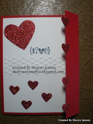
Pretty huh?  This card is started with a piece of Real Red card stock cut at 5 1/2" x 9 3/4".  You then score it at 4 1/4" and 8 5/8".  That folds the card in the middle and creates the flap you see on the outside.  I added a layer of Whisper White to the inside right away.  Then for the front of the card, I also wanted a piece of Whisper White but I wanted to emboss it across the middle.

This impression folder is from the new set in the Occasions Mini called Adorning Accents.  You use it just like the other impression folders with your big shot.  It is just much smaller and will only emboss a strip of the paper.  Once the hearts were embossed, I adhered the card stock to the front with snail adhesive.  I then turned to my wonderful red glimmer paper and punched out 2 full hearts and 14 small hearts.  I added one full heart to the top of the card and then stamped my greeting.  This one comes from the retired set called Valentine Defined.  I then took 3 small hears and placed them on the bottom half making sure to not place any of them under the flap.  On the outside of the flap, I placed 4 hearts coming down.  I put adhesive on the entire heart but only attached half to the front.

Next, you put adhesive on 4 more small hearts.  You then open the flap which will show you the back half of the hearts on the front.  Adhere another small heart to the back of each heart so that it shimmers on both sides.  (Did that make sense?  I hope it does.)  Line them up as best as you can. 


For the inside, I wanted to add some decorations so I put my other full heart at the top  left and the last 3 small hearts under it.   Once again I used the retired set called Love You Much for my greeting.  Once again I stamped it onto the white using the StazOn ink.  This time I colored it with my Real Red marker.  This is a quick card to make and a beautiful one to give to that special someone.

I cannot believe we are at Wednesday already.  Where does the time go.  I have a full day ahead so I better get to it.  I will be see you tomorrow with another share.  Thanks for dropping in today.


Monday, January 23, 2012

Hearts Hearts Hearts

Welcome everyone. 

This week, I thought we would spend some time on the big holiday next month - Valentine's Day!  I always enjoy the special surprises my husband gets for me.  It is a wonderful day to remind those who are special to us just how much we love them.  Some of the cards I share will have a definite girl feel to them but I will try my best to share some that could be for men too.  So let's take a look at today's share.


I would say this is a girl card wouldn't you?  Anyway, I started this card with a base of Whisper White.  I selected Melon Mambo and Pretty in Pink as the two colors I would use for the rest of the card.  First I put a layer of Melon Mambo.  I then took a piece of Pretty in Pink and ran it through my big shot using the Vintage Wallpaper impression folder.  I placed this in my color catcher and sprayed it with Frosted Shimmer paint mixed with alcohol to add sparkle.  Then it was time to make my flowers.

Here is a close up of the flowers.  I started by punching 3 scallop squares.  Using my small heart punch, I punched 4 hearts for each flower - 2 Melon Mambo and 2 Pretty in Pink.  I also punched a 1/4" circle for the center of each flower.  Once the flowers were made, I placed them into the color catcher and spritzed them with the frosted alcohol mix.  They needed to shimmer too.  I attached them to the Pretty in Pink layer using my snail adhesive.

My greeting for this one comes from the stamp set called Outlined Occasions which will be available in the Sale-a-bration catalog later this month.  I stamped it on white using StazON ink.  It is colored using my Stampin' Up! markers.  I then trimmed it out using my scissors,  spritzed with the frosted alcohol and attached using dimensionals.  


For my inside greeting, I chose to use a retired stamp set called Love You Much.  I have always liked this set.  I stamped the image directly onto the card with StazOn ink and colored it with the markers, following the color scheme.  

I wanted to thank all of you again for understanding why I took last week off.  The actual funeral will be this coming Sunday but it feels good to be crafting again.  Tomorrow's card can be given to that special male in your life or to a female.  So be sure to stop by to see what I have for you.  Thanks for dropping in today!!

Tuesday, January 17, 2012

A Sad Sad Day

I wanted to be sure to post something today to let you all know that I will not be posting this week.  We had a very unexpected death in our family yesterday.  It has saddened us all tremendously.  My husband and I will be spending this week preparing for the funeral and helping our family in any way we can.  It is always hard to lose someone but to lose them so young is so tragic. 

I hope you can all understand why I have chosen not to blog this week.  Please come back next Monday.  I promise to have a card to share.  I just need to take care of my family right now. 

To our friend, family member, coworker, and brother in arms may you rest in peace and be in the arms of our Lord for all eternity.  To his wife and children, we are here for you and will always be here for you.  We love you very much. 

Take care everyone and I will see you Monday, January 23rd.  Thanks for understanding. 

Friday, January 13, 2012

He's Out Of This World!!

Thank goodness it is finally Friday.  Okay it is Friday the 13th but I personally don't buy into the theory that it is a bad day.  As far as I am concerned, it is the end of another week.  It has been a really long week.  My husband has been gone a lot and extremely busy.  I do miss him when he is not here.  I am so proud of all the work he does.  He is truly a remarkable human being and I am blessed to have him in my life.

Now on to a fellow who is not a human.  He is rather cute though!!  Again he is part of the Looney Toons family and if you watch the cartoons you probably already know who I am talking about.  Let me introduce him to you.  Ladies and gentlemen, meet .........


......It's Marvin the Martian!!!!!  I just love this guy.  He makes me laugh every time I see him.  So let's get started on this card.  I used a Whisper White card stock for the base of my card.  I then added a layer of Basic Black to it.  I chose to use Marina Mist for the top layer.  Prior to attaching it, I punched out circles in Whisper White, Basic Black and Basic Gray.  I used the 1", 3/4", and 1/2" circle punches to do this.  I then laid the circles in a random pattern on the Marina Mist paper until I was happy with how it looked.  Then I adhered them down using runner adhesive.  Next it was time to texture the card stock.  I chose to use an impression folder from Cuttlebug called Spots & Dots.  I liked the look of all the circles behind Marvin.


He has the sweetest little face don't you think?  Once again, I learned this punch art character from Ellen Kemper, and again I would suggest you visit her blog for instructions on how to create him and the correct punches to use.  This was the second one I made and he looks really good in my opinion.  

Do you like his shoes?  I love them!!  They are just too cute for words.  I just wanted to show you a close up of them.  
As you head off into the weekend, I wish you one filled with happiness.  Since Monday is a holiday, I too am going to take the day off from blogging.  With a little luck, maybe I will get some much needed time with my husband.  I have missed him so.  I will be back on Tuesday with a new card to share.  Thanks for dropping in today and I will see you Tuesday.

Thursday, January 12, 2012

"My Biscuits Are Burnin'"

Have you ever heard that phrase before?  Do you know who said it?  Well if you do then you know which Looney Toon character I will be sharing today.  I will admit, I made this one before about a year ago.  However, I did not take any pictures before giving it to a friend for his birthday.  So this is actually my second time making him.  Of course, it had been a year so there are flaws.  It was just like making him for the first time again.

I have rambled enough so let's get started for today.  Ready to see him?  Here we go!!


It's Yosemite Sam himself!!  I bet you knew that already though.  Once again, I turned to the punch queen Ellen Kemper to learn how to make him.  But as always, let's start at the beginning and move to the character himself.  My base card is Always Artichoke.  I have to tell you, I was really stumped on what to do for his backdrop.  As I was taking a shower it hit me.  I remembered the beautiful desert scene stamp I bought to do the stain glass technique with.  I decided to just stamp it using StazOn ink onto Whisper White card stock and color it in with colored pencils.  The scene seemed to suit him.  I layered it on a piece of Basic Black and then adhered it to the Artichoke card. 

I bet you see my flaw already.  When I was attaching his whiskers, I got a little glue on the top of them.  I tied to erase it with my adhesive eraser but it did not work so well and the result is what you see.  So Be careful when putting those pieces on but at the same time always remember the flaws simply add character to your card.  Overall lesson:  don't sweat the small stuff.  As I said earlier, I learned this from the queen of punching herself.  If you would like a list of punches and instructions on how to make him, simply email me or visit Ellen's Blog.  Look on her list of topics for people and you should find him.  The card stock colors I used are Crumb Cake, Tangerine Tango, Blushing Bride, Basic Black, Daffodil Delight, Cherry Cobbler, and Night of Navy.  I do like this guy to give to men.  He always tries to act so macho.  Let's face it, don't all men try to act macho at one time or another?  Sam here is just more up front about it. 

It has been a busy week so far.  I am glad tomorrow is Friday.  I hope your week is moving along smoothly.  I will return tomorrow with one more character for you.  Until then, thanks for dropping by today and I'll see you tomorrow!!

Wednesday, January 11, 2012

It's Wabbit Season!

Now if you are a fan of Looney Toons, you probably know the character that cannot pronounce "R"'s.  Every time he says a word that begins with the letter "R" it comes out as a "W".  My husband is a huge fan of Looney Toons and has quite the collection of memorabilia displayed in his office.  So when I visited the punch queen Ellen Kemper's blog and saw all the characters she had made using punches, I just had to try my hand at a few of them.  I made a Bugs Bunny face for my husband and a Tweety for my daughter.  So now it is time to try some other characters.

Since I have been talking about masculine cards and how they seem to be my most difficult concepts to come up with, I wanted to choose characters I felt would work for men.  This guy is the first one that caught my eye.


Say hello to Elmer Fudd.  I hope you recognized him.  I know there are some flaws on him but this was my first attempt so please be forgiving.  Besides, those flaws give him character and make him a one of a kind.  I learned to make Elmer from Ellen Kemper as I said before.  That is the only thing I cased on this card.  The rest is my own design.  Let's start with the background and move onto him.  My base card for this one is Night of Navy.  I chose to take a piece of shimmer white card stock to use as my layer.  I ran it through my big shot using an impression folder called Stars from Cuttlebug for this one.  After I made Elmer and placed him on the card front, I added some red glitter glue to the center of the visible stars.  I guess I was feeling a little patriotic.  


Here's a closer look at Elmer's face.  He is a happy little fellow don't you think?  Anyway, I know you may be wanting to learn to make him yourself so my suggestion would be to go to Ellen's Blog to get the full list and directions.  The card stock color's I used are Always Artichoke and Basic Black for his outfit.  I used Blushing Bride for his face, neck, and hands.  I drew his face on and colored the whites of his eyes with a white gel pen.  


Here is the rifle up close.  Again the directions are on her blog.  I used Early Espresso and Brushed Silver for this.  I think it looks pretty good.  As long as you can tell it is a rifle, I am okay with it.  
As with all punch figures, he does take a little bit of time to make and if you are like me, you will make a few mistakes and need to redo some of the pieces.  I still encourage you to try though.  The figures are so cute they are definitely worth it. 

That's all for today.  I will share another character tomorrow so please come back to see him too.  Until then, thanks for stopping by today.  See you later and happy stamping!!


Tuesday, January 10, 2012

Neutral Cards

Yesterday, I went with the masculine theme to hopefully inspire you when you need to make a man's card.  Today I thought I would share what I call neutral cards.  These are cards that could be used for a man or a woman.  Most of the time, I only need to change the color scheme of the card to fit it for a man or for a woman.  I think it is important to have a few of these on hand so you are not caught off guard.  So let's get to the card.


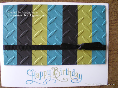
I started this card using a Whisper White piece of card stock.  I try to stick to neutral colors for the base card of these so that it will fit the person no matter what.  There is a simplistic elegance to it that just seems to come across to me.  I hope it does to you.  Let's break down the 2 main components of this card.

Starting with the top piece, I used a piece of Basic Black card stock cut at 3" x 5 1/8" .  I then chose my color pattern to work with for my stripes.  For this card it is Island Indigo, Basic Black, and Lucky Limeade.  I cut strips of each color at 3/4" x 3".  I then decide on my pattern for this card.  I placed runner adhesive all over my black backing and carefully placed my strips on it.  Once the strips were all on, I placed the piece into the Diamond Plate impression folder and ran it through the big shot.  I then took a piece of 1/4" grosgrain ribbon and tied a simple not around it.  


The greeting comes from the stamp set Perfectly Penned.   I wanted it to fit in with the color scheme so I decided to used my Stampin' Up! markers to ink the stamp.  This allowed me to use both Island Indigo and Lucky Limeade to color the letters on the stamp.  Use the brush tip end of the markers to do this and be patient.  You need to do this carefully so you get the look you want.  I always mouth breathe a warm breath of air onto the stamp to re moisten any part of the ink that may have started to dry.  Stamp it down and see how beautiful it looks.


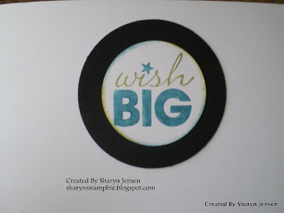
For the inside, I turned to my stamp set called Word Play.  I used the same 2 colors of ink to color the words here too.  Again use the brush tip of the marker to apply the ink to the rubber.  I punched it out using my 1 3/4" circle punch.  I took my sponges and edges the circle using the Indigo and Limeade ink to make it pop.  I then layered the white circle onto a Basic Black circle punched out with my 2 1/2" circle punch.  The colors really stood out then!!
To change the feel of this card to be more feminine, simply choose colors that make it feel that way to you.  For me, I turn to pinks or purples or bright colors.  Give this one a try.  It is such a simple card to make but looks great when finished.  

Hopefully your Tuesday is going well.  I will be back tomorrow with another card to share with you.  Please come by to see it.  Thanks for dropping in today!


Monday, January 9, 2012

Difficult Cards

Happy Monday everyone.  I hope you all had a wonderful weekend.  I tried to get a few chores done as well as rest a little bit along the way.   Now it is time to jump into a new week and see what it has in store for me. 

From the title, you might be thinking that our theme today is sympathy.  While I do find those cards difficult to make at times it is more because of why I have to make it and not the actual design.  The most difficult type of cards for me to make are masculine cards.  I just do not come up easily with ideas for these.  I will sit and look through sample after sample hoping to be inspired but it always takes a while.  So I have decided to challenge myself with the task of making some of these cards.  I am going to try to have one per week but no promises.  Today I do have one to share.  It has some of my husbands favorite things on it. 


TOOLS!!!!  What man does not like tools?  This card was pretty fun to make and I made extra tools for a few other cards too.  The base card is Chocolate Chip card stock.  I stamped the from of it with the Woodgrain stamp just to add a textured look to it.  This stamp is from SU!.  It is quite large so it will cover the entire front of the card at one time.  I then took a piece of Crumb Cake and cut it to the size I wanted.  I ran it through the big shot using an impression folder from Cuttlebug called Diamond Plate.  I like this folder for manly cards.  It actually caught my attention because it reminded me of the bumper on my husband's ladder truck.  I edged the Crumb Cake with Chocolate Chip ink to darken the edges.  It is attached using runner adhesive.  The greeting is from the Look Who's Turning stamp set.  It is stamped with Chocolate Chip ink on Very Vanilla card stock and punched out using the word window punch.  I layered it on a piece of Crumb Cake punched with the modern label punch.  It is attached to the card using dimensionals.


 To make the tools, I started by taking my Totally Tool stamp set and stamping each tool using StazOn ink.  I then used my colored pencils and colored all the tools.  Once colored, you just need to cut them out.  I think the measuring tape is the hardest to cut out.  I have seen people attach these to the card using brads, giving the appearance of pegs on a board.  I chose not to do this.  I simply randomly placed the tools on the Diamond Plate until I was happy with the look and attached them using Tombo Liquid glue.  


This is a shot of the inside of my card.  I chose the screwdriver because I loved the saying.  I am positive it fits lots of guys out there.  It is stamped on Very Vanilla using Chocolate Chip ink, layered on a piece of Crumb Cake and attached using runner adhesive.  I did not want to color the tool inside.  I thought it looked good just as it was.  After all, most men don't really care about bling.  They are looking at the overall concept.
Well that's it for today.  I hope your Monday is a good one.  Take time to stamp today and be creative.  It always helps you have a good day!  Thanks for stopping by!


Friday, January 6, 2012

Shimmery Butterflies

Yesterday I shared a Valentine card with you which I used Wisteria Wonder card stock to make.  Now as promised I want to share another Wisteria Wonder card with you.  This one is a birthday card and had those beautiful butterflies on it.  Here in Arizona, we do get to see these beautiful creatures every now and then.  I just love all the colors of them.  No 2 ever look exactly the same.  So of course I did not want mine to look the same.  I did use the same colors.  So let's get started shall we. 

  
The base is the Wisteria Wonder card stock.  For the layer on top,  I used a piece of Whisper White card stock.  I ran it through the big shot using the Elegant Bouquet impression folder.  I did want to add just a hint of color to the flowers.  Using my Wisteria Wonder Stampin' Up! marker, I colored the center of the flowers.  The greeting is from the stamp set Perfectly Penned and is stamped in Wisteria Wonder ink.  Now to the butterflies.


These two little guys are what makes this card so special.  I am sure you can see the sparkle on them.  Let me show you the larger one.


Believe it or not I used the Silver Shimmer paper to make these.  I started by running a piece of Silver Shimmer paper through my big shot using the beautiful butterflies bigz die.  This cut out both of my butterflies at the same time.  Now I could have attached them and left them silver, but I really wanted some color on them.  It is hard to see the Marina Mist color, but hopefully you can see the Wisteria Wonder and Lucky Limeade.  You may be asking how did I do this?  How did I get the color onto the butterflies?  Well it is so easy I just know you will want to try it yourself.  I used the ink pads of the colors I wanted and sponges - 1 sponge for each color.  I added color to the sponges by rubbing them on the ink pads.  Then you simply rub them on the paper and voila', instant color appears.  I have seen others add color using aqua painters and ink refills but this way did the job just fine.  To get the color to appear darker, you just need to keep adding more color to the paper.

Now everyone knows how I love glitter and shimmer so you can imagine how excited I was to learn this trick.  Expect to see it show up again sometime.  

Here we are at Friday, the end to another week.  I hope all of you have a wonderful and restful weekend.  I will return Monday with another share for you.  Until then, thanks for dropping in today.  See you Monday!

Thursday, January 5, 2012

Another Valentine, A Different Style

Yesterday, I shared with you a Valentine card I made using Melon Mambo.  Now I am a pink lover so anything pink always grabs my attention.  However that does not mean I dislike other colors.  So today I wanted to share another card with you using the same stamp from yesterday but this time I turned to the purple family.


I was inspired to make this card by another demonstrator.  No I don't remember her name but if she is looking I hope she will let me know.  Anyway, my base card for this one is Wisteria Wonder.  Don't you just love that name?  For the first layer I chose to use Whisper White.  I ran it through the big shot using the Stripes impression folder.   By now I am sure you have noticed that this is a card of many textures.  I think that is what gives it personality.  So as we view the card, I will be sure to tell you which impression folders I used.  Back to the card.  Once the white layer was attached, I cut a piece of Wisteria Wonder at 3 1/4" x 4 3/4".  Before attaching it to the white, I wanted to add the squares.  I used 6 different impression folders to achieve the looks on the squares:  Finial Press, Vintage Wallpaper, Perfect Polka Dots, Elegant Lines, Houndstooth, and Elegant Bouquet.  I used scraps of Whisper White and embossed them using these folders.  I then punched out squares using my 1 1/4" square punch.  I tried to leave a 1/4" border around each one.  Let's look at the greeting.


I started my greeting by stamping it on a piece of Whisper White using StazOn ink.  This stamp is out of the Sale-a-bration catalog set called Outlined Occasions.  I then ran it through the big shot using the oval frame from the Designer Frames impression folder set.  Once it was embossed, I cut around it.  I then used Wisteria Wonder and Elegant Eggplant SU! markers to color in the greeting.  Using my 2-way glue pen, I added dazzling diamond glitter to the outer edge of this.  It is attached to the card using dimensionals.  The embossed squares under it are the polka dots and elegant lines.  I chose to put these here because, the other ones seemed to achieve the overall look I was going for and were easy to add gems to.  So let's look at the top 2 squares and then the bottom 2.

Here you can see the top 2 squares.  The folders used on these are the Finial Press and Vintage Wallpaper.  I added gems to the center of both of these.  Also, when I punched the square out, I tried to be sure to center the design.  

The bottom 2 squares utilized the Houndstooth and Elegant Bouquet impression folders.  It was easy to decide where to put the gems on the bouquet but the houndstooth proved a little more challenging.  I finally decided to just add a row of gems across the square.  I actually like how it looks.  
As a card maker I am sure you know that you can create 2 cards from 1 sheet of card stock.  So tomorrow, I am going to stick with the Wisteria Wonder color for the base card.  However, the design and theme will be different.  Hopefully you will return to have a look at my card.  I do appreciate you coming by today.  See you tomorrow. 

Wednesday, January 4, 2012

Valentine's Day Is Just Around the Corner

It is hard to believe we are already into 2012.  The holiday season just seemed to fly by to me.  Now I don't know about you but I still have my Christmas tree up.  It will probably come down soon but I intend to enjoy it as long as I can.  Just think, in a little over a month, it will be Valentine's Day.  So I decided we would take a look at some of the items in the Occasions mini while looking at a card for that special day. 


Except for the decorative label punch, glitter and card stock, all products used on this card are from the Occasions Mini Catalog and Sale-a-bration catalog.  I chose the color Melon Mambo for my base card.  I love this color and it fits the holiday well.  I am going to go through the materials used to make this card but it will be easier to go through one part at a time.  So let's get started.


To start, I used a new item called Adorning Accents textured impressions embossing folders to make the hearts on the bottom of the card.  It is an impression folder like many we have used before except it is only about an 1" wide.  It is meant to be an accent not an entire covering.  I then took a piece of Whisper White to use as my layer on top.  I cut it to be the same width and length as the front of the card.  I then used another new item called Adorning Accents Edgelits Dies.  These are thin pieces of metal that have one raised side.  You put the raised side against your card stock where you want to cut it.  Then use platform 1 of the multi-purpose platform for the big shot along with the cutting pads.  Create your sandwich just like always and run it through.  What you get is the serrated edge of the white.  The piece will just come off and you will have a lovely design to accent your card.  I wanted to add an embossed look so once again I turned to the Adorning Accents impression folders.  This pattern is meant to work hand in hand with the edgelits.  Line up the impression folder so that it is aligned with the scallop edge and run it through the big shot using the cutting pads and platform 2 like always.  Okay so this may sound a little confusing but I promise you it is not.  

Do you like the little hearts on the white part?  Well I used my handy Melon Mambo card stock and Pretty in Pink card stock to do these.  Once again, I used a new product from the Occasions Mini.  This one is an Embosslit die called Fashionable Hearts.  These are the dies that both cut and emboss the hearts at the same time.  Love, love, love this!!!


As you can see, the hearts are all over the front of the card.  I attached them with my 2-way glue pen.  The greeting comes from a stamp set called Outlined Occasions.  This set is available to you from the Sale-a-bration catalog.  All you have to do is order $50 worth of merchandise from the Idea Book and/or the Occasions Mini and it can be yours for FREE.  I thought this set was fun.  I love to color and this set appealed to that side of me.  Any way, I stamped the "Love" using StazOn ink on Whisper White card stock.  I then used my SU! markers in Melon Mambo and Pretty in Pink to color this.  I then punched it out using the decorative label punch and added dazzling diamond glitter to the edge of it using the 2-way glue pen.   Then I created a frame for this out of Melon Mambo using the same punch.  Too cute!!

I hope this inspires you to make some Valentine's cards.  I also hope you are inspired to take a look at the Occasions Mini and Sale-a-bration books.  I think you will like what you see.  I will be back tomorrow with another card to share.  Thanks for dropping in today and I will see you tomorrow. 


Tuesday, January 3, 2012

Arrgh Maties! The Pirates Are Here!

Last we I made a couple of cute birthday cards featuring Bob and Larry from Veggie Tales.  As I was making them, I could not help but think of some of the songs they have made.  One that stood out was "The Pirates Who Don't Do Anything".  My oldest is a huge pirate fan and really liked this song.  I have it set as her ringtone whenever she calls me.  So making a pirate card seemed like the natural thing to do. 


While these are not vegetables, I still like them very much.  As always, let's start at the beginning.  My base card is made from Early Espresso card stock.  The layer on top is Whisper White.  I used my SU! pastels to create the background of sky, ocean, and sand.  I added some fine tip black marker birds to the sky and thin lines of glue for glitter to the ocean waves.  The glitter is dazzling diamonds.  For the sun and treasure chest, I turned to my Cricut machine and a cartridge called Life's A Beach.  The sun is made using Daffodil Delight card stock.  The face was added to the sun by the Cricut and I accentuated the features of it using a fine tip black marker.  I also added a little orange chalk to the sun just to highlight it.  For the treasure chest, I cut out 2:   one from Early Espresso and one from Brushed Gold.  I used my craft knife and cut along the lines created by the Cricut on the Brushed Gold chest.  This left me with the outline to actually layer on the Espresso.  I also made sure to add the lock.  Then I filled the chest with gems for the treasure.  


I used the owl builder punch to make my pirates.  The first one got a hat as his special feature.  The card stock colors used for him are Early Espresso for the body and large eye circle, Whisper White for the medium eye circle, Basic Black for the small eye circle and the medium circle used for the eye patch and finally Tangerine Tango for the heart for the beak.  For this owl, I used a piece of retired dsp in Tempting Turquoise for his shirt.  The hat is an owl punched out in Basic Black and cut in half.  To complete the eye patch, I used a fine tip black marker to draw on the lines representing the elastic piece that goes around the head.  This picture also allows you to see the treasure chest a little closer.  I added the black dots to it for the nails.  Now on to the next pirate!

This little guy's special feature is his peg leg.  For the main part of the pirare, I used exactly the same card stock colors listed above.  One difference for this guy is his shirt is from a retired piece of dsp with Green Galore as its color.  I was sad when this one retired.  I loved Green Galore.  The  other difference is his peg leg.  To make it, I used a scrap piece of Crumb Cake and cut a thin strip off.  I then snipped off one of his feet and added the leg.  

These pirates are very easy to make and can be put together quickly.  Give them a try.  I am so glad you came by today and looked at my card.  Please come back tomorrow to see what I make next.  Thanks for dropping in today.  See you tomorrow.